Gana partnered with Nizen to refresh the brand’s visual communication through new packaging design and an expanded social media presence. The project focused on translating the precision and quality associated with Japanese healthcare products into a contemporary visual system. We redesigned product packaging and developed an ongoing social media strategy to strengthen the brand’s connection with its audience. The result is a refreshed identity that communicates both product credibility and modern appeal.
Category
Branding, Gudelines and Website design
Client
Nizona Marine Products
Year
2025
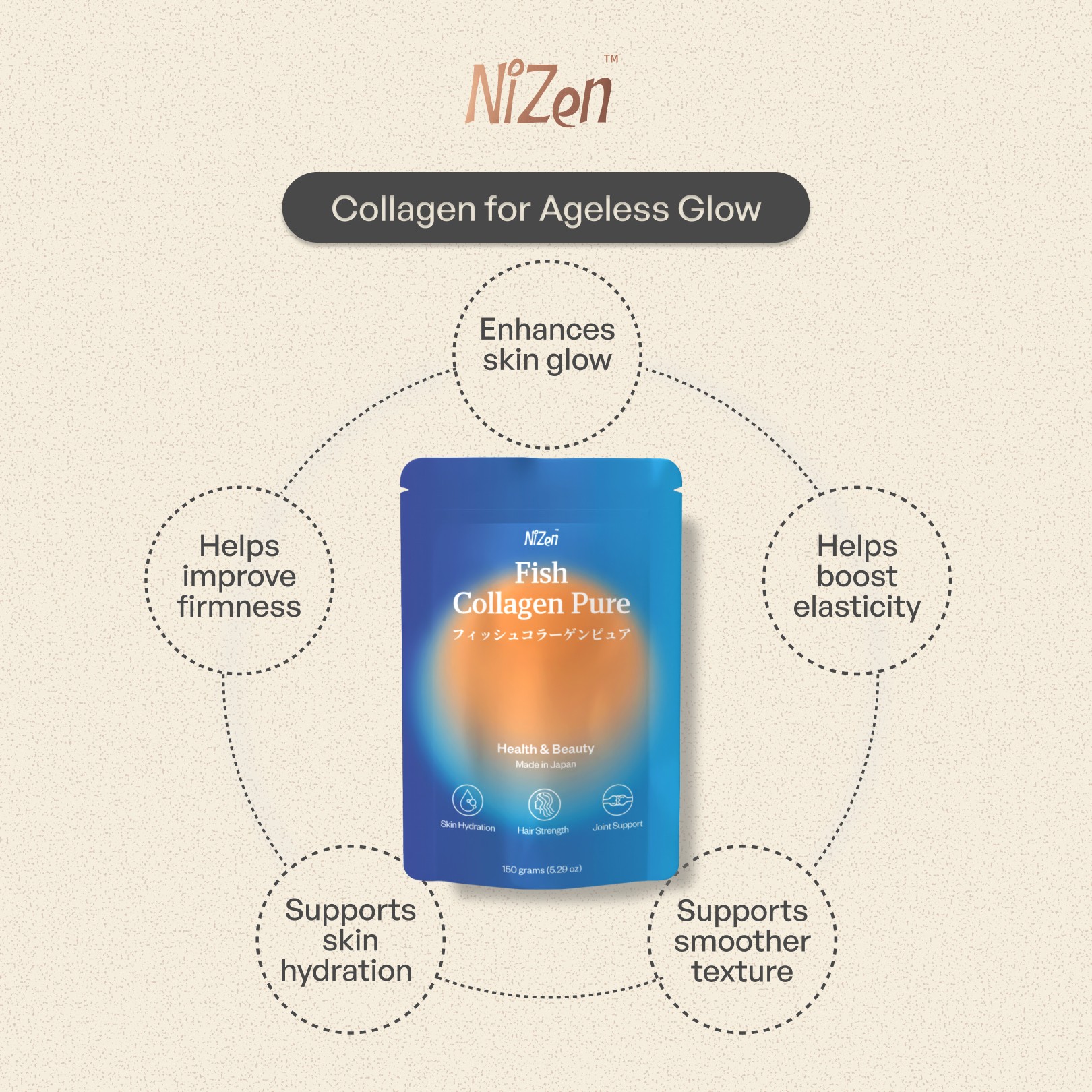
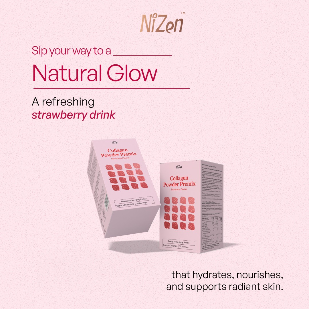
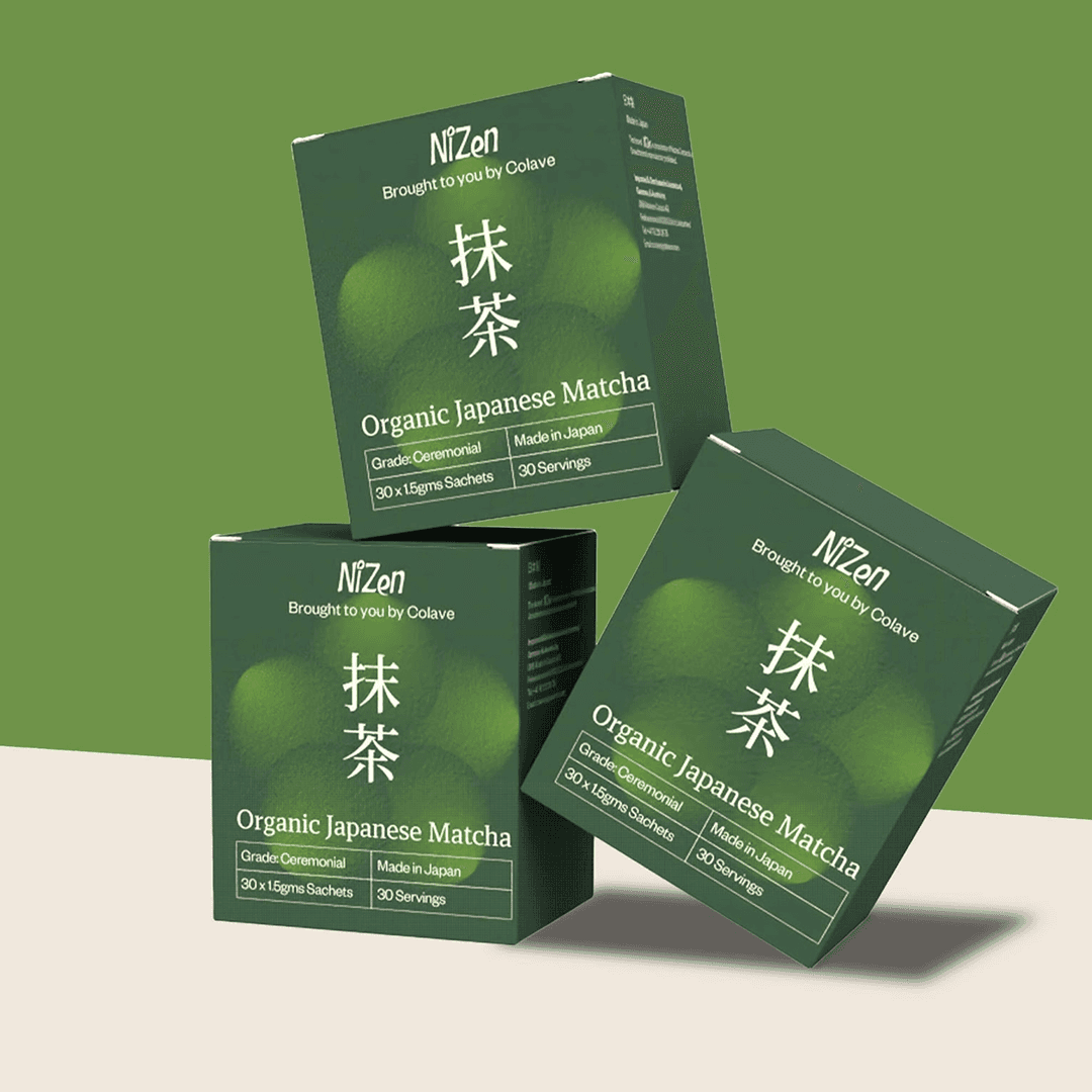
The packaging system balances clarity with playfulness, using bold colour, clean typography and distinctive product cues to communicate flavour, function and origin. Japanese visual references and typographic structure reinforce the brand’s positioning around quality and authenticity. Each product was designed to feel precise, contemporary and immediately recognisable as a Nizen Product
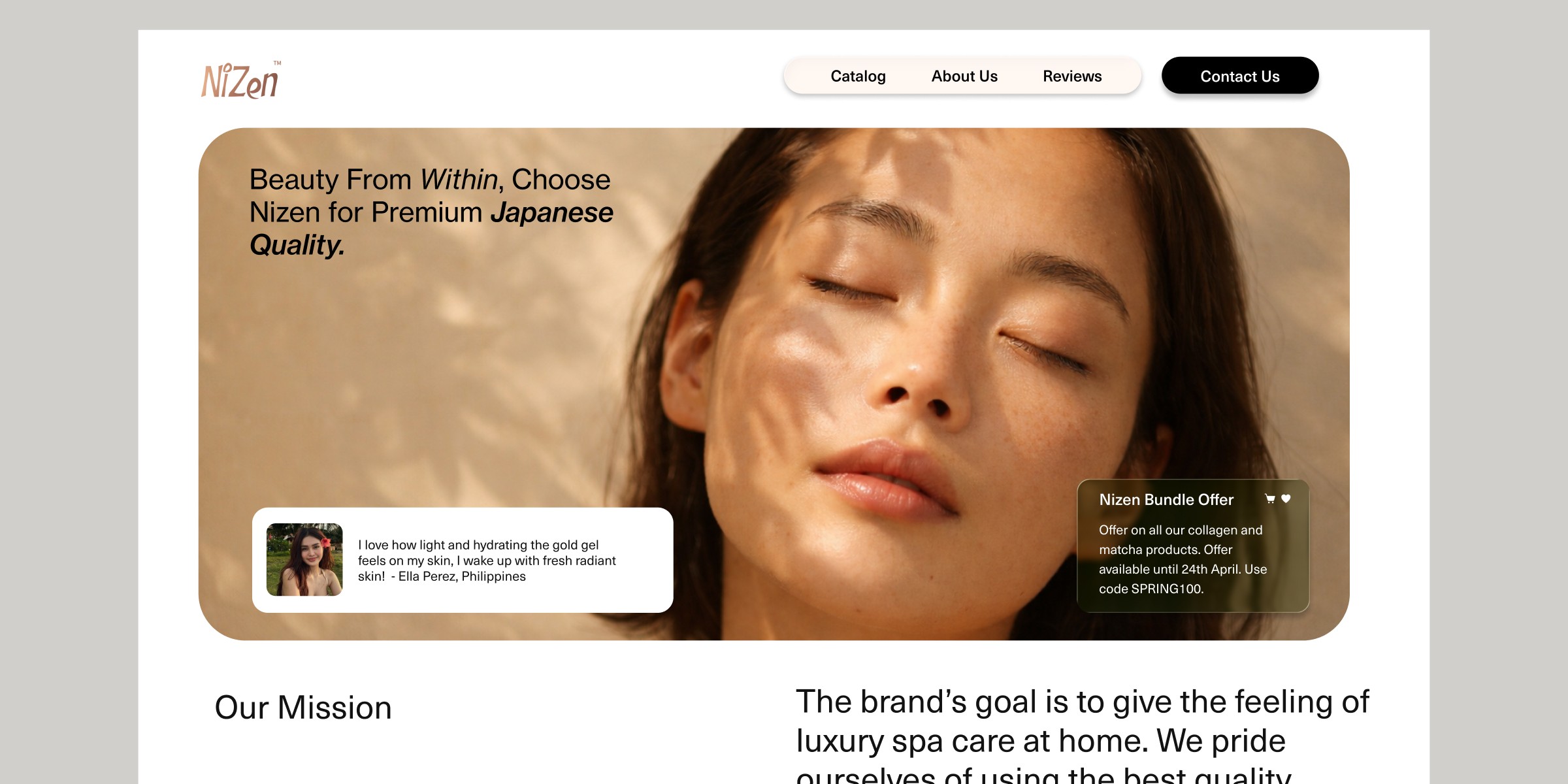
The project demonstrated how thoughtful packaging and consistent digital communication can quickly modernise an established brand. By introducing a clearer visual hierarchy and stronger product storytelling, the brand now communicates its value more effectively. A structured content strategy also allowed the brand to maintain a consistent and engaging presence across digital platforms.
Gana Agency
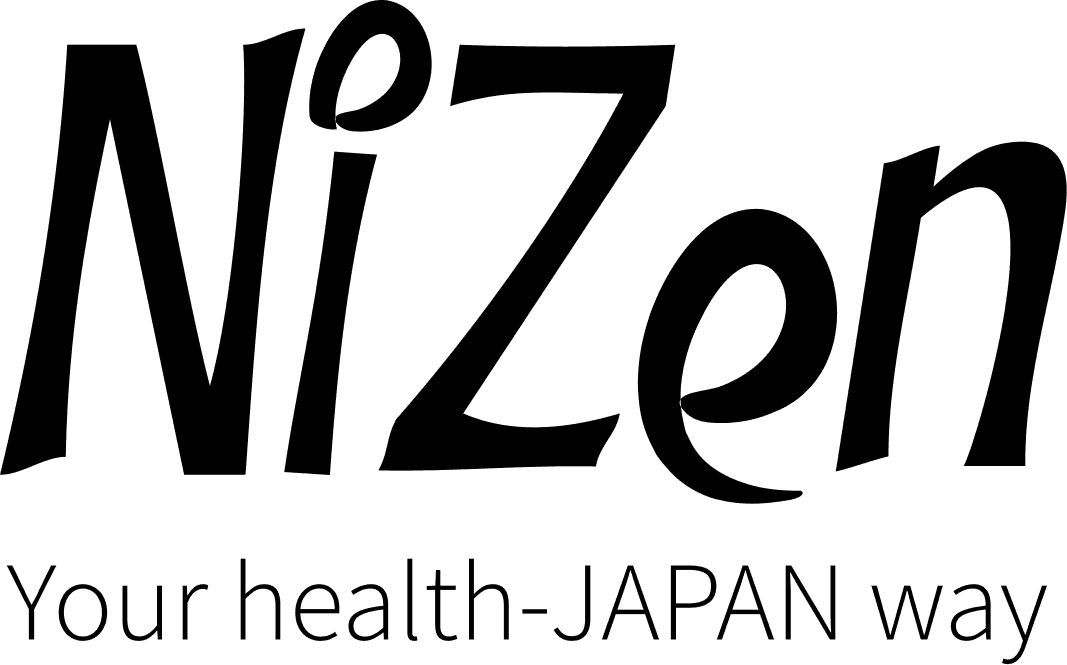
NIZEN